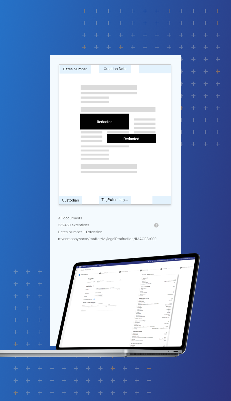


Project Overview:
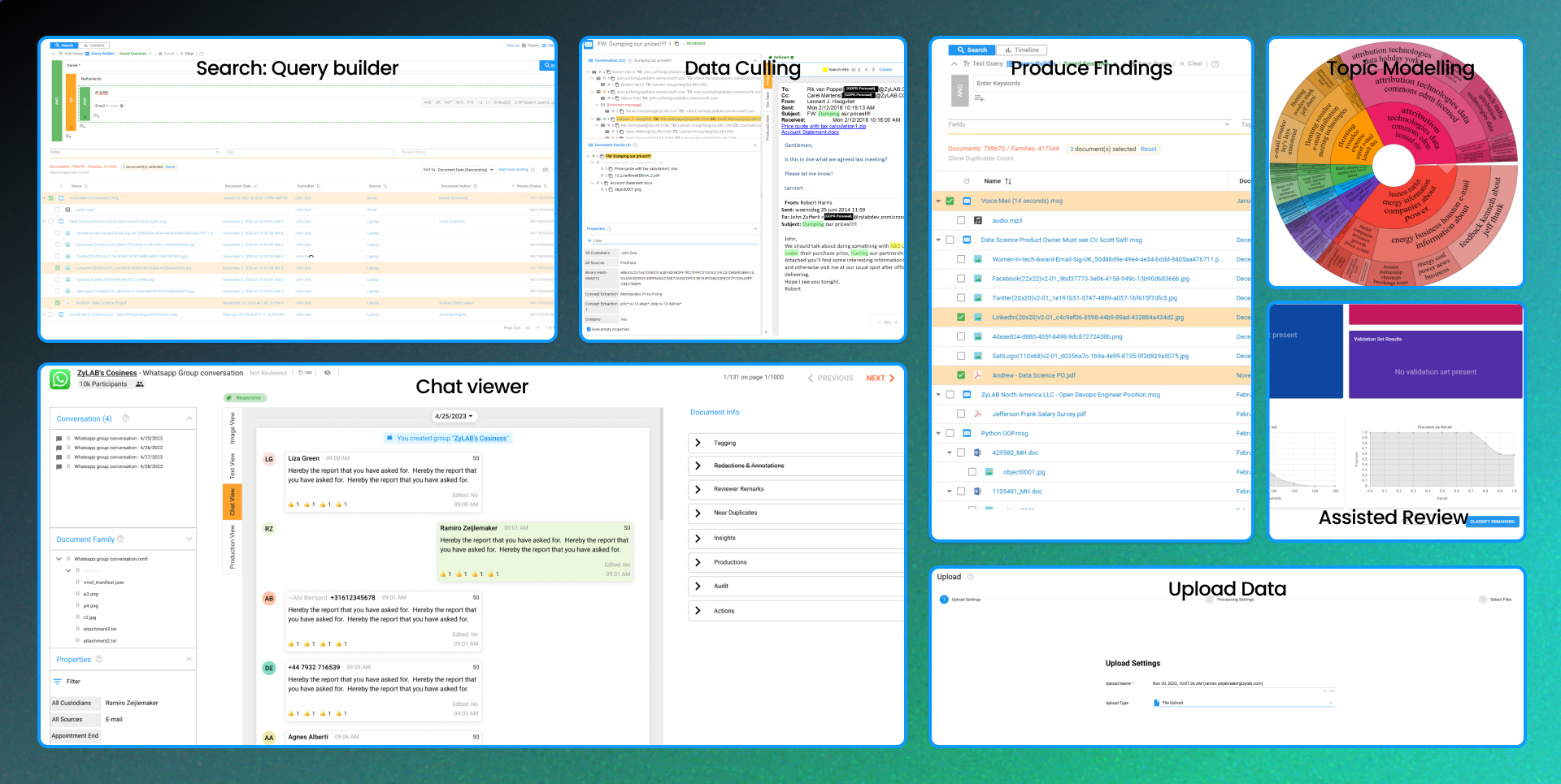
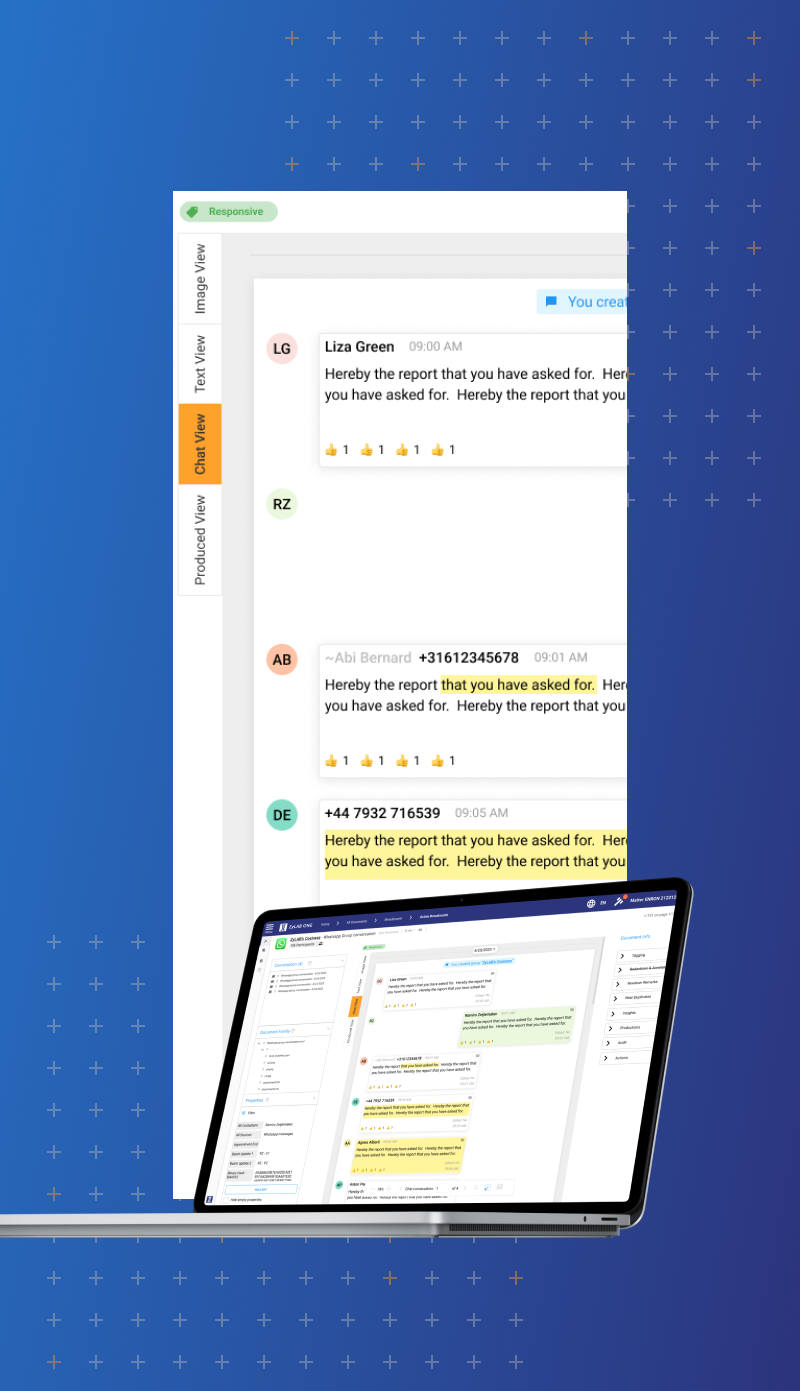
ZyLAB ONE is a leading eDiscovery platform helping companies manage large data volumes for legal and compliance purposes. My role was to improve the user experience, focusing on efficiency and ease of use for legal professionals.
Problem:
Users struggled to find relevant information quickly, leading to time loss and frustration, ultimately reducing the productivity of legal teams.
Goal:
- Simplify the interface to make complex tasks more intuitive.
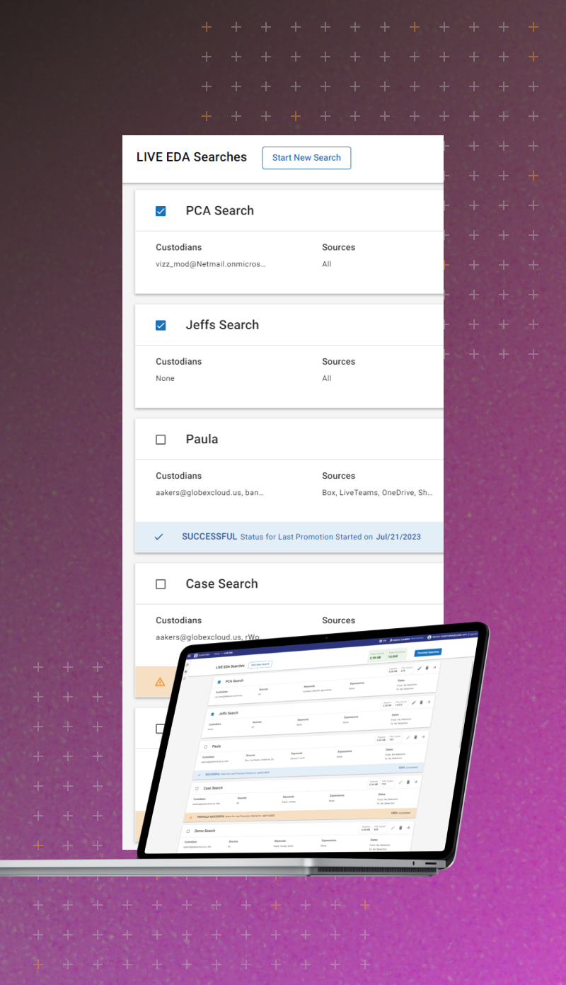
- Optimize the search functionality for faster, more relevant results.
- Enhance overall usability without sacrificing functionality.
My Role:
I served as the lead UX designer, collaborating closely with product managers, developers, and end-users to create a redesign that was both aesthetically appealing and functionally efficient.
Process and Approach:
- Research and Insights
Conducted user interviews and data analysis to identify pain points in the current interface. - Personas and Scenarios
Created personas to better understand user needs, helping us develop targeted solutions for various user groups. - Wireframes and Prototypes
Developed multiple iterations of wireframes and prototypes to test new design ideas, gathering feedback and making adjustments quickly. - Testing and Optimization
Conducted user testing with clickable prototypes, leading to critical changes in flow and layout, focusing on search improvements and streamlined navigation.
Results:
- Increased Efficiency: Users can now search documents 30% faster due to the optimized interface.
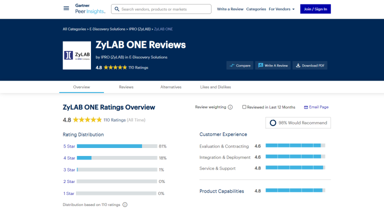
- Improved User Satisfaction: User satisfaction scores increased by 25% after implementing the new UI.
- Faster Onboarding: New users can now learn the system faster thanks to a more intuitive design.
Conclusion:
The redesign of ZyLAB ONE resulted in a better overall user experience, higher productivity, and more satisfied users. By applying user-centered design principles, we made a complex platform more user-friendly and efficient.
