

Bridging Design and Business
Overview
In the fast-paced realm of e-discovery, where the management of information is paramount, the user experience (UX) holds a pivotal role. Our products must excel in efficiency, consistency, reliability, intelligence, and user-friendliness. In response to the recent merger between IPRO and ZYLAB, our UX Team embarked on a mission to foster collaboration, enhance communication, and establish a robust UX strategy. This case study delves into our journey towards crafting an ultimate UX strategy, spanning the realms of research, design, evaluation, and reporting.
The essence of UX Strategy
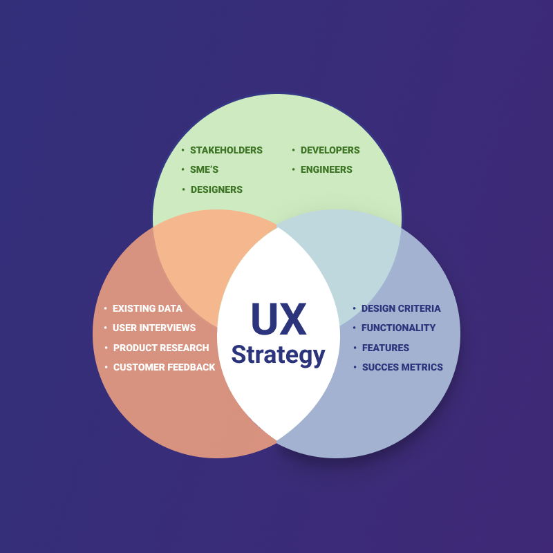
At the core of our transformation lay the concept of UX strategy, a comprehensive approach to ensure that our products align with organizational goals and user needs. It is the blueprint that guides our journey, aiming to deliver products that meet and exceed user expectations. Our UX strategy embodies the following key elements:
1. Business Alignment
Our UX efforts are intrinsically tied to the success of the organization. By enhancing user satisfaction, fostering loyalty, and driving profitability, we contribute meaningfully to our company’s growth and sustainability.
2. User-Centered Approach
Our unwavering commitment revolves around understanding and meeting user needs to create products that delight and engage. We don’t just aim to satisfy users; we aim to exceed their expectations.
3. Innovation
We cultivate a culture of continuous improvement and innovation within UX design and research practices, always striving to push boundaries and explore new horizons.
4. Cross-Functional Collaboration
Collaboration among diverse teams and departments, including design, development, marketing, and customer support, is at the heart of our strategy. This ensures a seamless user experience across the board.
5. Establishing Measurable Outcomes
We define key metrics and KPIs to assess the effectiveness of our UX efforts, underpinning our decisions with data and analytics.
6. Embracing Adaptability
We acknowledge that user needs and market conditions evolve. Our commitment is to adapt and evolve our UX strategies accordingly, ensuring relevance and effectiveness over time.
Assessing UX Maturity
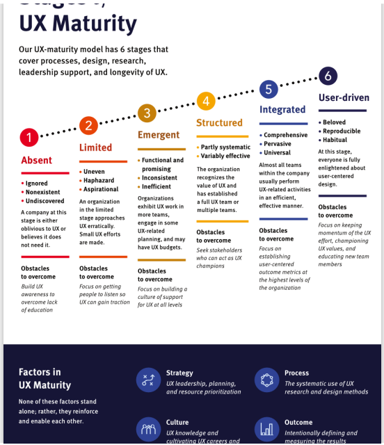
Our journey began by assessing the maturity of UX within our organization. It was evident that communication between our team and various departments such as PMs, developers, QA, and documentation teams was inconsistent. This discrepancy led to the realization that the North America (NA) team operated at Level 2 (Limited), while the Europe, Middle East, and Africa (EMEA) team excelled at Level 4 (Structured).
In response to this discrepancy, a presentation was delivered to our team outlining EMEA’s effective communication practices. The need for change was recognized, but the transformation wasn’t limited to our team alone. It required an organization-wide shift. Consequently, an organizational presentation was conceived to introduce our team, elucidate our workflows, and outline expectations, not just for our team, but for the entire R&D department in North America.
Crafting the Comprehensive UX Strategy
Our comprehensive UX strategy comprises several essential components, each playing a distinct role in ensuring a seamless user experience:
1. Research Program
Understanding our users is fundamental. Our Research Program employs methods such as usability testing, heuristic evaluation, and feedback collection to gather valuable insights. Initiatives include:
- Promotion of Internal Collaboration with UX
- Maintaining a User Experience team booking page.
- Creating a referral reward program for IPRO employees.
- Communicating new UX research opportunities internally.
- Testing late-stage prototypes internally.
- Emphasis on UX as a Company Focus
- Communicating our design philosophy and processes to the public.
- Integrating UX research into client communications through the CSM and Support teams.
- Leveraging the IPRO Tech Show.
- Enhancing the visibility of communication channels with UX in our products.
- Initiating conversations with UX after feature releases.
Announcing the UX Program in a blog article shared through the newsletter.
- Support for Precise User Targeting
- Promoting the User Bench Program to a list of users compiled by UX.
- Identifying opportunities to enhance specific features or flows.
- Recruiting target personas through the Client Advisory Council.
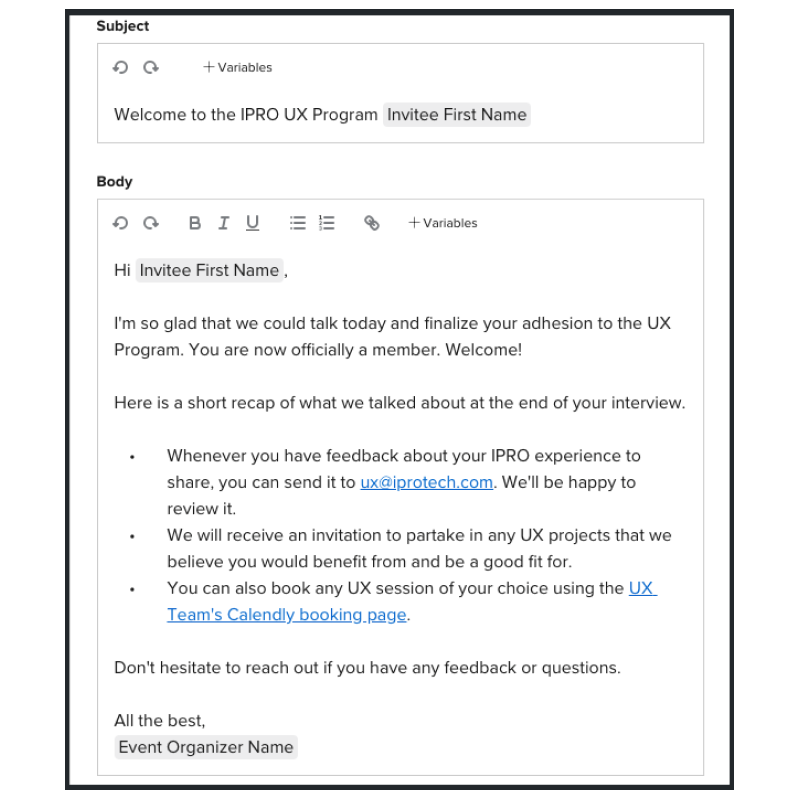
- Conducting a 25-Minute UX IPROgram Adhesion Interview.
- Conducting a 30-Minute Product Feedback Interview.
- Promotion of Internal Collaboration with UX
Design process

Our revamped Design Process is geared towards efficiency, collaboration, and data-driven decisions. It integrates tools like Figma and JIRA to streamline design workflows, ensure UX readiness, and engage engineering effectively. Key elements include:
Why Implement a Design Process
- Accelerating development.
- Involving engineering representatives early in projects.
- Prioritizing projects based on projected dollar value and productboard evaluations.
- Integrating Pendo and JIRA for seamless communication.
- Streamlining research efforts and workload management.
- Ensuring UX readiness by defining “done” with product managers.
- Role of User Testing and alpha/beta testing.
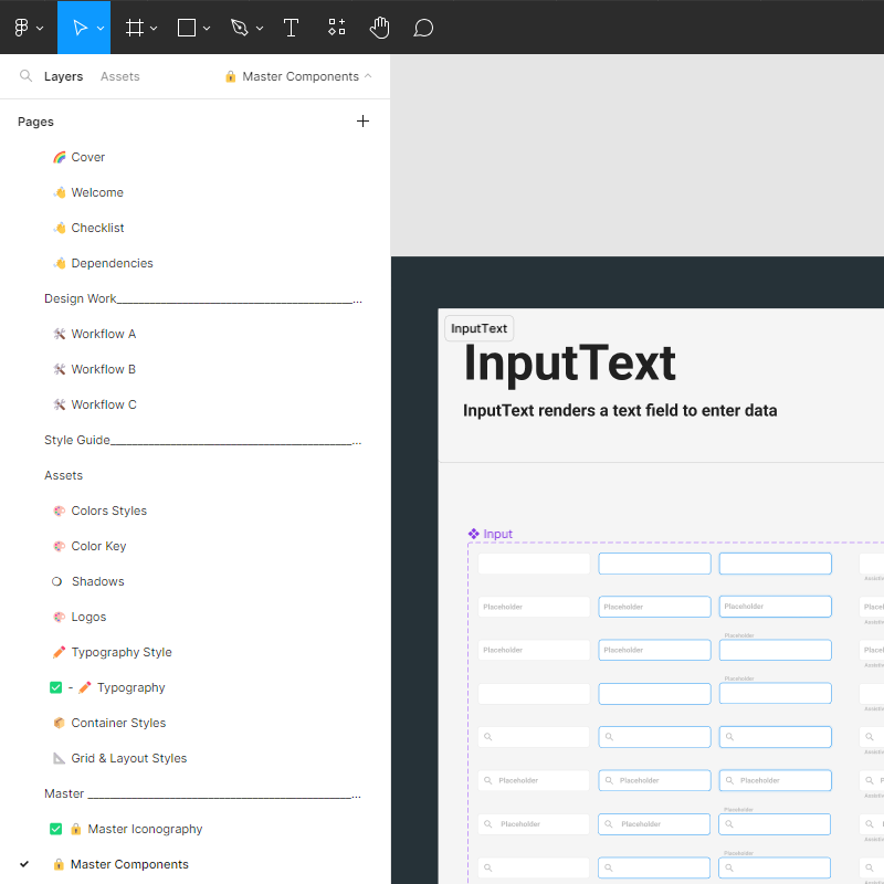
Design System
A robust Design System serves as the foundation for cohesive and user-friendly designs across our products. It addresses questions about design system differences, submission processes, maintenance, and accessibility:
- How do the IPRO and ZyLAB design systems differ?
- Current differentiation but with shared references.
- Benefits of a unified library at the engineering level.
- Consideration of design implications in future acquisitions.
- Flexibility for market-specific UIs while maintaining consistent patterns.
- Should we have a process to submit new components to be added into the design system?
- Consultation with the UX team for new components.
- Regular communication of changes.
- How should we maintain the design system? How often should we review it?
- Continuous work and regular communication.
- Continuous work and regular communication.
- How do we design/train for accessibility/responsive UI?
- Commitment to accessibility in every design.
- Scenario-based design for small, medium, and large screens.
- We’re using Material Design. Where does our design system pick up
- Utilizing Material atoms for creating our own organisms.
Evaluation Program
Evaluating the effectiveness of our UX designs is vital. Our Evaluation Program encompasses usability testing, heuristic evaluation, surveys, analytics, A/B testing, accessibility audits, post-launch monitoring, and iterative design. It ensures continuous improvement.
- Usability Testing: We conduct usability tests with real users to assess how well our designs align with user expectations and needs. These tests provide valuable feedback on navigation, task completion, and overall user satisfaction.
- Heuristic Evaluation: Expert evaluators assess our designs against established usability heuristics. This method helps identify usability issues early in the design process, allowing for timely adjustments.
- Surveys and Feedback Loops: We collect user feedback through surveys, feedback forms, and in-app mechanisms. This feedback helps us understand user perceptions, pain points, and suggestions for improvement.
- Analytics and User Behavior Analysis: Utilizing analytics tools, we track user behavior within our products. This data-driven approach allows us to identify trends, user patterns, and areas that require attention.
- A/B Testing: We implement A/B tests to compare the performance of different design variations. This helps us make data-backed decisions regarding feature implementations and optimizations.
- Accessibility Audits: Regular accessibility audits ensure that our designs comply with accessibility standards and provide an inclusive experience for all users, including those with disabilities.
- Post-Launch Monitoring: Our evaluation program extends beyond the launch phase. We continuously monitor user feedback, analytics, and performance metrics to identify areas for ongoing improvement.
- Iterative Design: Insights gained from evaluations inform design iterations. We prioritize and implement changes based on the severity of issues and user impact, ensuring a continuous cycle of improvement.
UX Reporting, Tools & Budget
Effective reporting is central to our UX strategy. We provide stakeholders with insights through KPIs, regular reports, visualization tools, user personas, journeys, benchmarking, and actionable recommendations
Our toolkit includes Figma, user testing platforms, analytics tools, accessibility checkers, feedback management tools, data visualization tools, communication and collaboration platforms, and usability testing labs, all geared towards supporting collaborative design and user-centered decision-making.
A well-defined budget supports the execution of our UX strategy. We allocate resources to research, tooling, personnel, training, accessibility, incentives, and benchmarking to ensure user satisfaction and business success.
Summary
Our comprehensive UX strategy is built on a foundation of user-centric principles, clear evaluation processes, effective reporting, and the right tools. By prioritizing user satisfaction and aligning with business goals, we ensure that our products deliver exceptional experiences. Our commitment to continuous improvement and informed decision-making drives the evolution of our UX strategy, ultimately benefiting our users and the success of our organization.
